使用 Manim 绘制自定义函数曲线

使用 Manim 绘制自定义函数曲线
老刘博客
你是否曾经想过,让复杂的函数曲线在屏幕上以动画形式优雅地呈现出来?或者希望通过编程,自定义并控制数学图形的每一个细节,使其生动地表达抽象的概念?本文将带你探索如何使用 Manim 实现这一切。
一、Manim 简介
Manim(Mathematical Animation Engine)是一个功能强大的Python库,用于创建专业级的数学动画。由知名数学视频博主3Blue1Brown(Grant Sanderson)开发,Manim能够以编程方式生成精美的动画效果,从函数曲线到几何图形,再到复杂的动画演示,皆可轻松实现。
- Manim 官方文档:https://docs.manim.community/
- Manim 教程:https://docs.manim.community/en/stable/tutorials/quickstart.html
- 3Blue1Brown YouTube 频道:https://www.youtube.com/c/3blue1brown
二、Axes 类概述
绘制自定义函数曲线会到Axes类,它是Manim中用于创建二维坐标轴的对象。继承自CoordinateSystem,并提供了丰富的方法来定制坐标轴的外观和功能。
Axes 类的主要功能包括:
- 创建自定义范围和刻度的坐标轴
- 绘制函数曲线和参数方程
- 添加坐标网格和刻度线
- 在坐标轴上添加标签和注释
三、创建坐标轴
3.1坐标轴
要创建一个坐标轴,首先需要实例化Axes类。以下是基本的使用方法
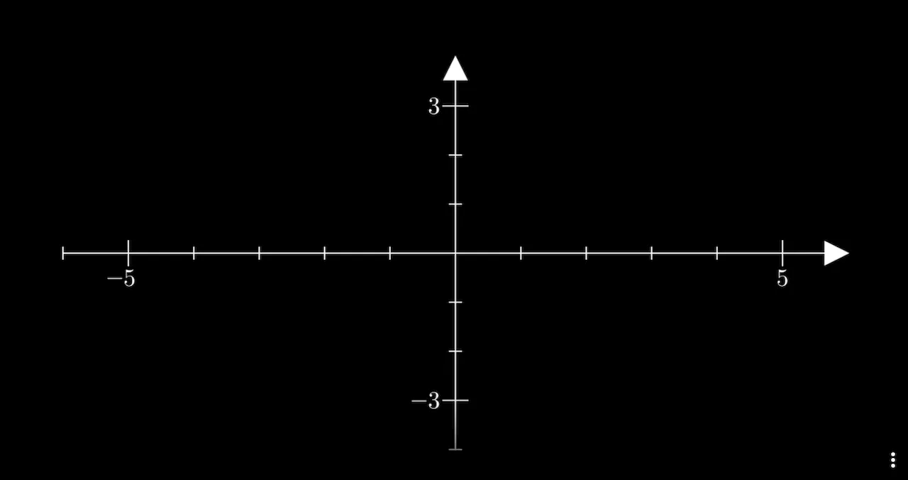
1 | axes = Axes() |
效果:

3.2坐标范围和刻度设置
x_range:设置x轴的范围和刻度,格式:
1 | x_range=[x_min, x_max, x_step] |
例如:
1 | x_range=[-5, 5, 1] |
表示x轴从-5到5,刻度间隔为1,同样的,
1 | y_range=[x_min, x_max, x_step] |
例如
1 | y_range=[-5, 5, 1] |
表示y轴从-5到5,刻度间隔为1,理解了基础代码,我们就可以设置坐标系基本样式,示例:
1 | axes = Axes( |

3.3轴标签和刻度数字
axis_config:用于定制轴的样式,一个字典,设置轴的通用配置。常用的配置项:
include_numbers:是否在刻度上显示数字(默认为 False)。numbers_to_include:指定要显示数字的列表。numbers_with_elongated_ticks:指定要加长刻度线的数字列表。
示例:在刻度上显示数字
1 | axes = Axes( |

3.4更高级的配置
如果需要更精细地控制轴的配置,可以使用 x_axis_config 和 y_axis_config。
1 | axes = Axes( |
3.5其中的配置项:
include_numbers:是否在刻度上显示数字(默认为 False)。numbers_to_include:指定要显示数字的列表。numbers_with_elongated_ticks:指定要加长刻度线的数字列表。
3.6轴样式定制
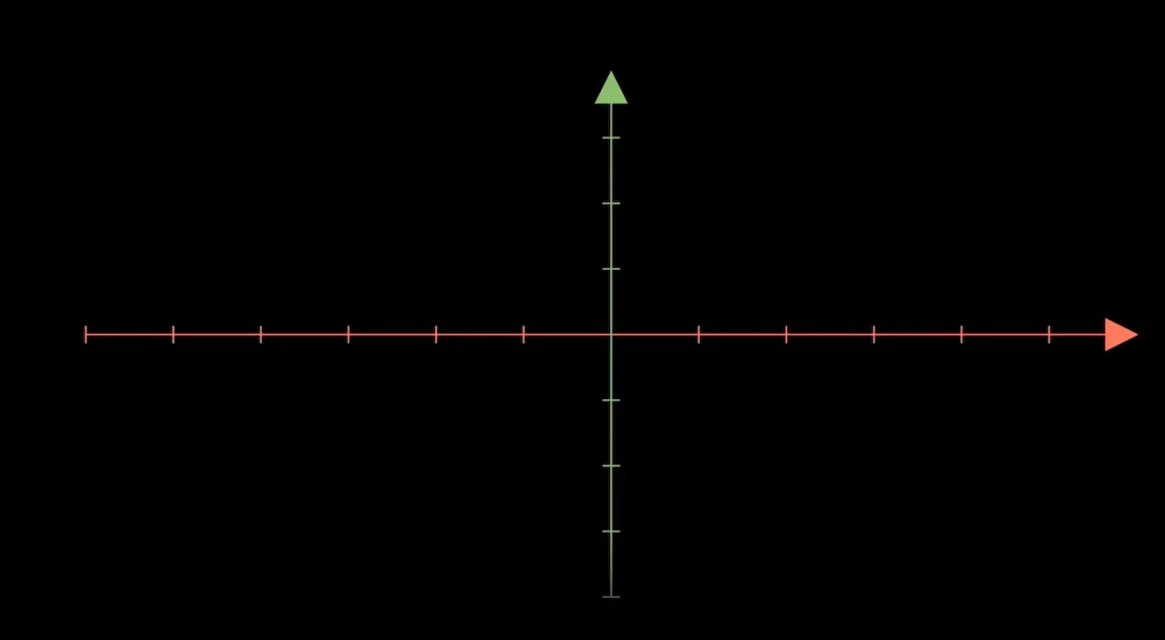
可以通过 axis_config 或 x_axis_config、y_axis_config 来定制轴的样式。
stroke_color:轴的颜色。stroke_width:轴的线宽。include_ticks:是否显示刻度线。tick_size:刻度线的长度。include_tip:是否在轴的末端显示箭头。tip_length:箭头的长度。
示例:定制轴的颜色和箭头
1 | axes = Axes( |
四、在坐标轴上绘制函数
4.1使用 plot 方法绘制函数曲线
Axes 提供了 plot 方法,用于在坐标轴上绘制函数曲线。
1 | curve = axes.plot(lambda x: x**2, color=BLUE) |
lambda x: x**2:要绘制的函数,可以是任何可计算的 Python 函数。color:曲线的颜色。

4.2自定义函数的绘制
您可以绘制任何自定义函数,例如三角函数、指数函数等。
1 | curve = axes.plot(lambda x: np.sin(x), color=YELLOW) |
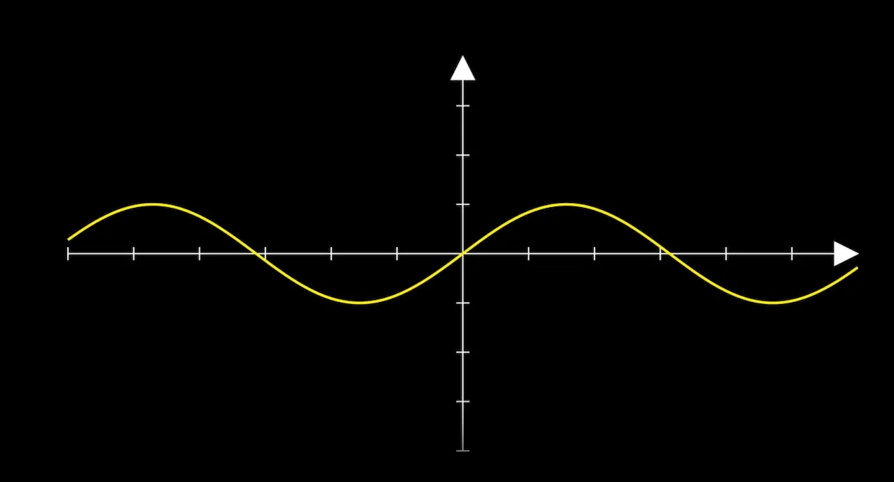
示例:绘制自定义函数
1 | def custom_function(x): |

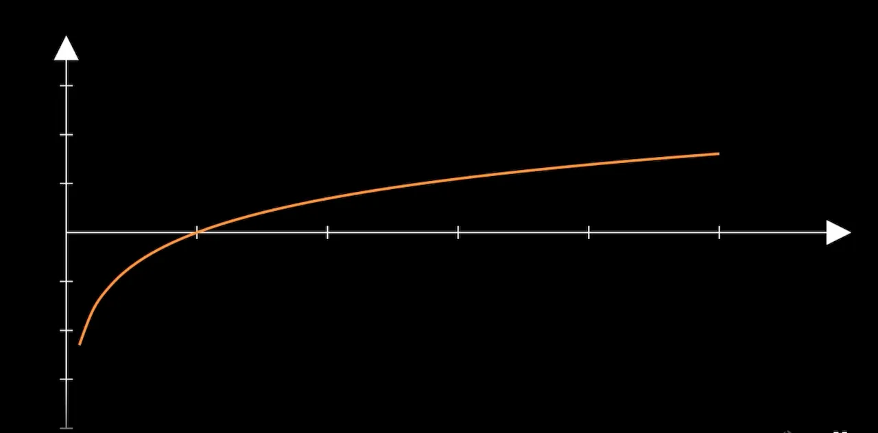
4.3曲线样式定制
可以通过以下参数定制曲线的样式:
x_range:指定函数曲线的 x 范围,格式为 [x_min, x_max]。
use_smoothing:是否对曲线进行平滑处理(默认 True)。
stroke_width:曲线的线宽。
示例:定制曲线范围和线宽
1 | curve = axes.plot( |
五、添加图形元素
5.1添加函数标签
为了在曲线上添加标签,可以使用 get_graph_label 方法。
1 | label = axes.get_graph_label( |
curve:要添加标签的曲线对象。
label:标签内容,可以是字符串或 MathTex 对象。
x_val:标签在曲线上对应的 x 值位置。
direction:标签相对于曲线的方向。
buff:标签与曲线之间的距离。
5.2添加点、线和注释
添加点:
1 | dot = Dot(axes.c2p(2, 4), color=RED) |
axes.c2p(x, y):将数据坐标转换为场景坐标。
添加垂直线:
1 | v_line = axes.get_vertical_line(axes.c2p(2, 4), color=GREEN) |
添加水平线:
1 | h_line = axes.get_horizontal_line(axes.c2p(2, 4), color=GREEN) |
添加注释文本:
1 | text = Text("关键点", font_size=24).next_to(dot, RIGHT) |
六、示例:
6.1上述功能完整示例
下面是一个完整的示例,演示如何使用 Axes 绘制自定义函数曲线,并添加各种元素。
1 | from manim import * |
运行效果
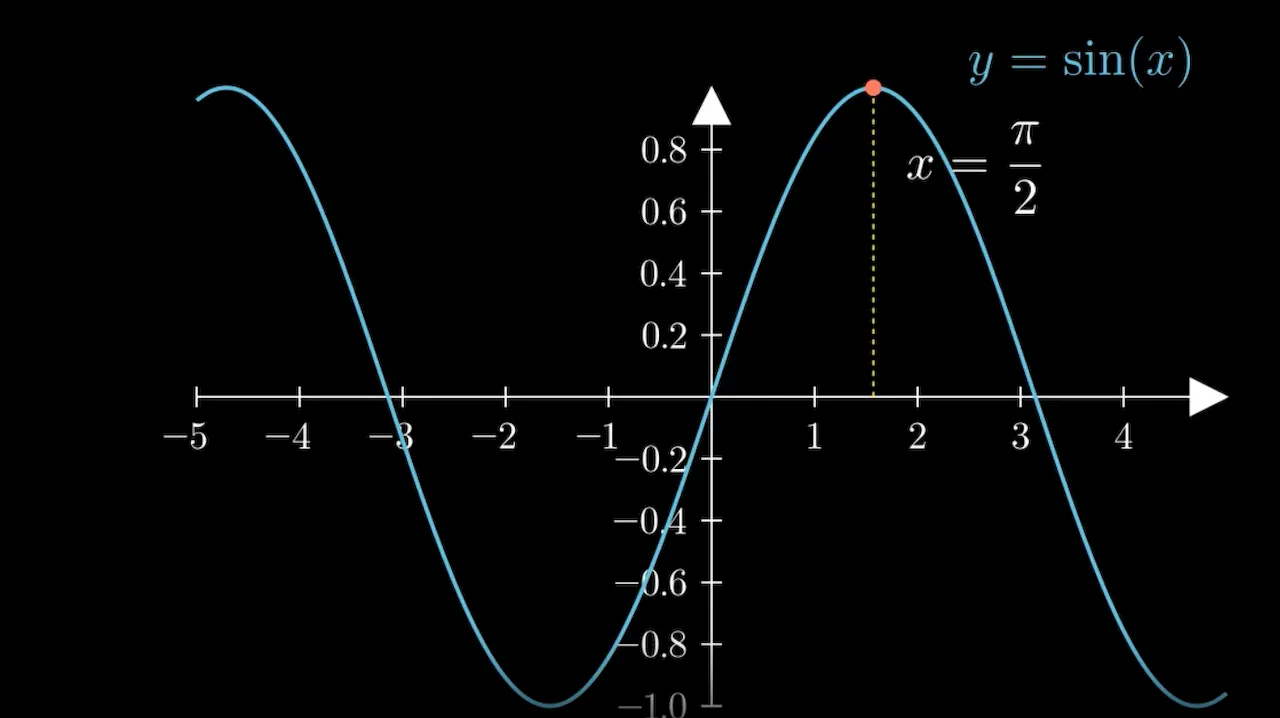
坐标轴:从 -5 到 5 的 x 轴和从 -1 到 1 的 y 轴,带有数字和箭头。
函数曲线:绘制了正弦函数 y = sin(x) 的曲线,颜色为蓝色。
函数标签:在 x=2 的位置,曲线的右上方添加了函数的数学表达式标签。
垂直线和点:在 x = π/2 处添加了一个红色的点和一条黄色的垂直线。
注释:在点的右下方添加了注释 x = π/2。
6.2示例: Sigmoid函数
1 | %%manim -qm SigmoidFunctionPlot |
效果

七、总结
使用Manim的Axes类来绘制自定义函数曲线关键点:
- 创建坐标轴:使用
Axes类,并设置x_range和y_range等参数。 - 定制坐标轴:通过
axis_config、x_axis_config和y_axis_config定制轴的外观和功能。 - 绘制函数曲线:使用
plot方法,将自定义函数绘制在坐标轴上。 - 添加图形元素:利用
get_graph_label、Dot、get_vertical_line等方法添加标签、点和线。 - 动画效果:使用
Create、Write、FadeIn等方法为元素添加动画。


